stirius_pa_final <- readRDS("01_data/stirius_pa_final.RDS") In this lab you will:
- classify model predictions into binary outcome using selected threshold,
- compose confusion matrix and calculate
specificityandsensitivityof the model, - plot the ROC curve and calculate AUC of the models,
- represent the models in the geographic space.
Before we start
Open the folder
Introduction to species distribution models,Start RStudio from the
Rproject iconnamedIntroduction to species distribution models.Open the R script named
Erebia stirius.When following this lab, continue to copy & paste the code in the script so it is organised as it is in teaching materials.
Lab plan
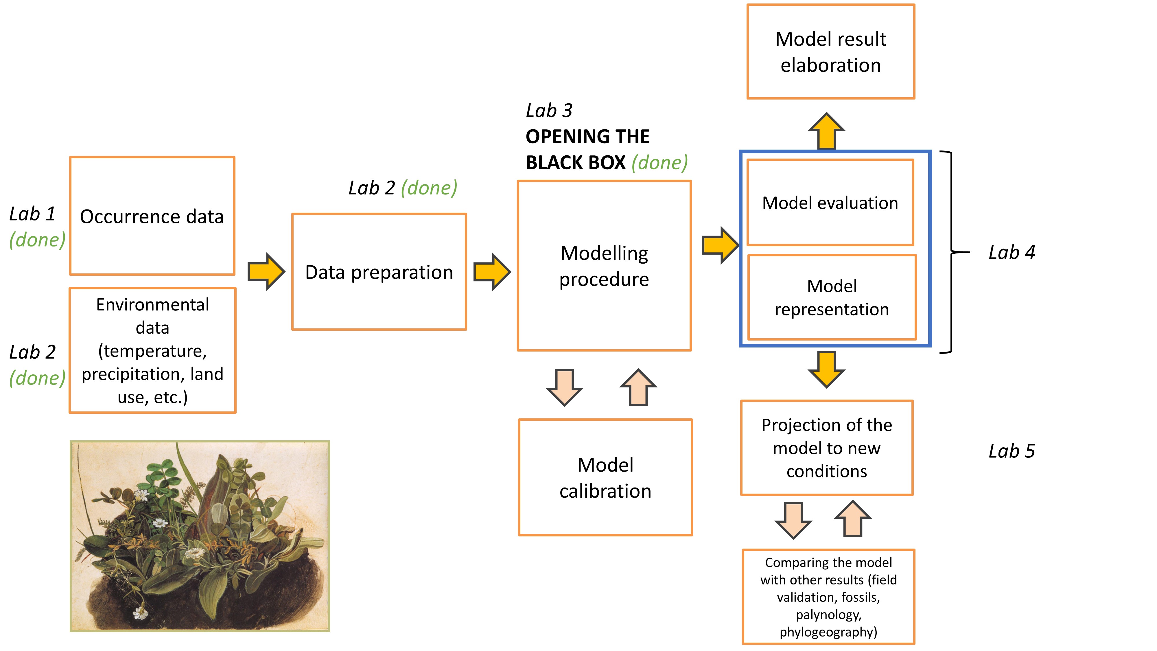
Data import from previous labs
First, we will load the data that we prepared on our last lab. The dataset is saved as .RDS files in 01_data folder. We will import it using readRDS() function and assign it to the objects with the same names as in lab 2: stirius_pa_final. This is a dataframe in which we prepared species presence points and pseudo-absence points and extracted values for not correlated environmental variables (bio2, bio4, bio6, bio 8, bio15, bio17 and bio18).
Recap from previous lab - opening the black box
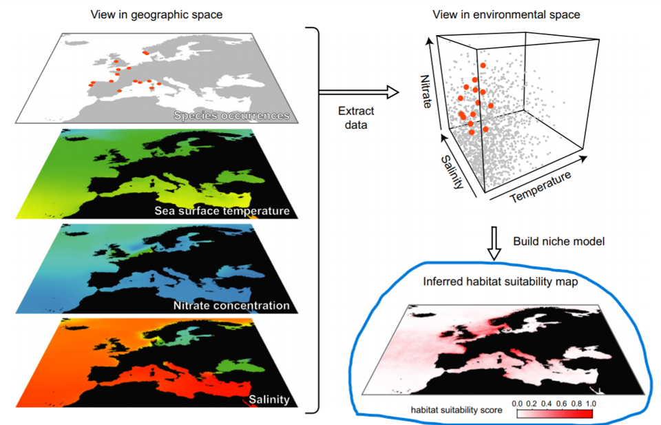
The task of a modelling algorithm is to identify potentially complex non-linear relationships in between presence-absence locations and multi-dimensional environmental space and project them to 2 dimensional geographic space.
Modeling algorithms will identify areas with similar environments to where the species has been observed. Most algorithms generally do not return the presence (1) or absence (0) of the species, but the probability or suitability for finding the species in any given cell on a map based on observed species-environment relationships.
There is plethora of different modelling algorithms used for modelling species/habitat distribution in the literature, that broadly belong to:
- statistical or regression (GLMs, GAMs, MARS, MDA & FDA),
- machine learning (RF, BRT, MAXENT) and
- artificial intelligence (ANN, SVM).
Due to high complexity of this field, we used only two following algorithms and just briefly addressed their main strengths and weaknesses:
- Generalized Linear Models (GLM) and
- Random Forests (RF).
Generalised linear models (GLM; Guisan et al., 2017, p. 167)
We built the model backwards, starting by a full model. This model included all possible environmental variables within our dataset and was the most complex of all models. Within glm() function we specified:
presence ~ bio2 + bio4 + bio6 + bio8 + bio15 + bio17 + bio18(presence explained by a linear combination of all bio variables),family = "binomial"(our response variable - presence - follows binomial distribution (0 and 1) and the model needs to take this into account)data = stirius_pa_final(to tell the model, where to look for the data).
and saved the results of this call to an object named glm_full:
We explored the results of glm_full using the summary() function, for interpretation of Coefficients, P-Values, Deviance and Akaike Information Criteria look at the previous lab materials.
We decided to remove bio17 as it was not significant according to the model. We rebuilt the model and based on its results also discarded the bio2 and bio18 variable. The last model that we built and also selected as the best was as follows:
glm_4 <-
    glm(
        presence ~ wc2.1_2.5m_bio_4 + wc2.1_2.5m_bio_6 + wc2.1_2.5m_bio_8 + wc2.1_2.5m_bio_15,
        family = "binomial",
        data = stirius_pa_final
    )
Random forest (RF; Guisan et al., 2017, p. 203)
Random forests or random decision forests are an ensemble learning method for classification, regression and other tasks that operates by constructing a multitude of decision trees at training time. The random forest model essentially represents an assembly of a selected number of decision trees, a flowchart-like structure made of nodes and branches. At each node, a split on the data is performed based on one of the input features, generating two or more branches as output.
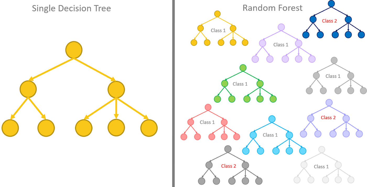
The random forest model can be fitted using randomForest() function from the randomForest package. A call to build a random forest needs the following arguments:
presence ~ bio2 + bio4 + bio6 + bio8 + bio15 + bio17 + bio18(presence explained by a linear combination of all bio variables),data = stirius_pa_final(to tell the model, where to look for the data),
and the following two we added optionally:
importance = TRUE(To assess importance of predictors in the model),na.action = na.omit(A function to specify the action to be taken if NAs are found - we will disregards NAs if present).
and saved the results to an object named rf_full:
library(randomForest)

rf_full <- randomForest(presence ~ wc2.1_2.5m_bio_2 + wc2.1_2.5m_bio_4 + wc2.1_2.5m_bio_6 + wc2.1_2.5m_bio_8 + wc2.1_2.5m_bio_15 + wc2.1_2.5m_bio_17 + wc2.1_2.5m_bio_18,
                        data = stirius_pa_final,
                        importance = TRUE,
na.action = na.omit)Copy and paste the code for both models as we will need them throughout this lab.
Assesing model accuracy and predictive performance
Overview of the topic and exhaustive suggestions of literature in Guisan et al. (2017, Chapter 15). Explanatory videos of Sensitivity and specificity and ROC & AUC.
To evaluate models predictive power, the model predictions are classified into four categories:
True positive (TP; cases when the model correctly predicted positive outcome - 1)
True negative (TN; cases when the model correctly predicted negative outcome - 0)
False positive (FP; cases when the outcome was negative (0), but the model predicted positive outcome(1))
False negative (FN; cases when the outcome was positive (1), but the model predicted negative outcome(0)).
and displayed in a confusion matrix:
IMPORTANT NOTE: Binary model predictions are required (i.e. 0 and 1) in order to complete the confusion matrix. As our models will provide continuous predictions, we need to set a threshold that will divide our data into binary categories (Pearson, 2010, pp. 77).
Using these four values (TP, TN, FP, FN) we can compute many different metrics about the model accuracy, precision, predictive power, etc., of which we are now interested in:
- sensitivity, the ability of a model to correctly identify true positive cases (TP / [TP + FN]) &
- specificity, the ability of a model to correctly identify true negative cases (TN / [TN + FP]).
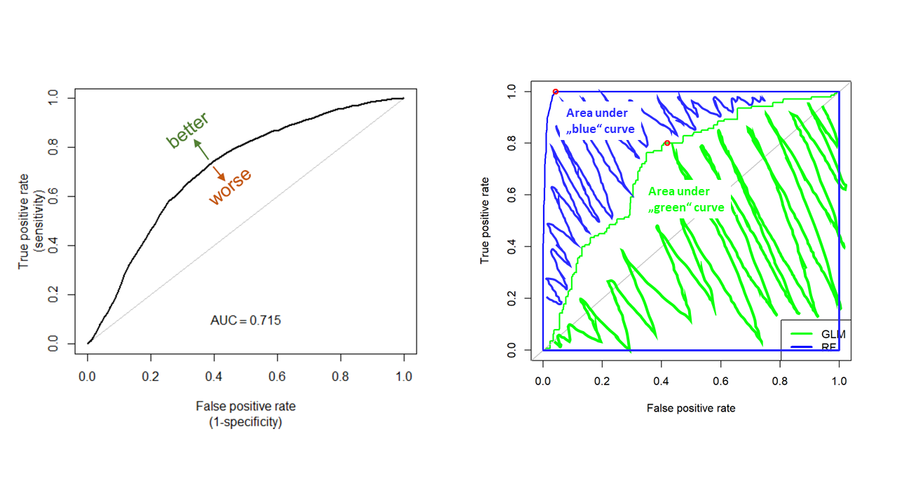
A Receiver Operating Characteristic curve (ROC curve) is a graph showing the performance of a classification/regression model for continuous response variable at all possible thresholds. This curve plots the changes in the above mentioned two parameters as:
- True Positive Rate (sensitivity) on y-axis &
- 1 - True Negative Rate (specificity) on x- axis.
Sensitivity and specificity are used, because these two measures take into account all four elements of confusion matrix. The ROC curve thus describes relationship between the proportion of observed presences correctly predicted (sensitivity) and the proportion of observed (pseudo) absences incorrectly predicted (1 - specificity). The model with perfect predictions would generate a line following left axis and top of the plot. A model with random predictions would follow a diagonal:
The Area Under the ROC Curve (AUC) test is derived from the ROC curve. Predictive performance of a model accross ful range of thresholds is measured as the area under the ROC curve, expressed as a proportion of the total area of square defined by the axes. AUC metric is desirable:
- as it is scale-invariant. It measures how well predictions are ranked, rather than their absolute values.
- as it is classification-threshold-invariant. It measures the quality of the model’s predictions irrespective of what classification threshold is chosen.
AUC can range in values from 0 to 1. However, a model which predictions are random would have an AUC of 0.5 and the model which predictions are 100% correct has an AUC of 1.0.
Application of ROC and AUC analysis to our models
Generalised Linear Model
First, we will need to extract predicted values from glm_4. The function glm() calculated them by default and store them in the $fitted.values section of the glm_4 object. We will add these values to our starting dataframe stirius_pa_final using $ function from base package. A small but important tweak in the code is putting the predicted values glm_4$fitted.values within unname(). This step is needed, as otherwise row names are attached for some reason and we would not be able to apply subsequent functions to the actual values.
The function options(scipen = 999, digits = 4) will ensure that the numbers will be displayed as decimals (i.e. -0.0000000000000001811) not as scientific notation (i.e. -1.780798e-16) and thus easier to understand.
options(scipen = 999, digits = 4)

stirius_pa_final$glm_4_predictions <- unname(glm_4$fitted.values)
To see how our table looks like with the new column:
View(stirius_pa_final)Next visual will show us how the actual presences and pseudo-absences are distributed along the predicted value of the GLM model. Right away, I added an arbitrary threshold line at 0.55 (geom_vline(xintercept = 0.55)), that seems reasonable to classify our model output to binary categories:
library(ggplot2)

ggplot(stirius_pa_final,
       aes(x = glm_4_predictions,
           fill = as.factor(presence))) +
    geom_density(alpha = 0.5) +
    xlim(c(0,1)) +
    theme_classic() +
    geom_vline(xintercept = 0.55, col = "red", lwd = 1.2) +
    ylab("Density") +
    xlab("Predicted probability of occurrence - GLM")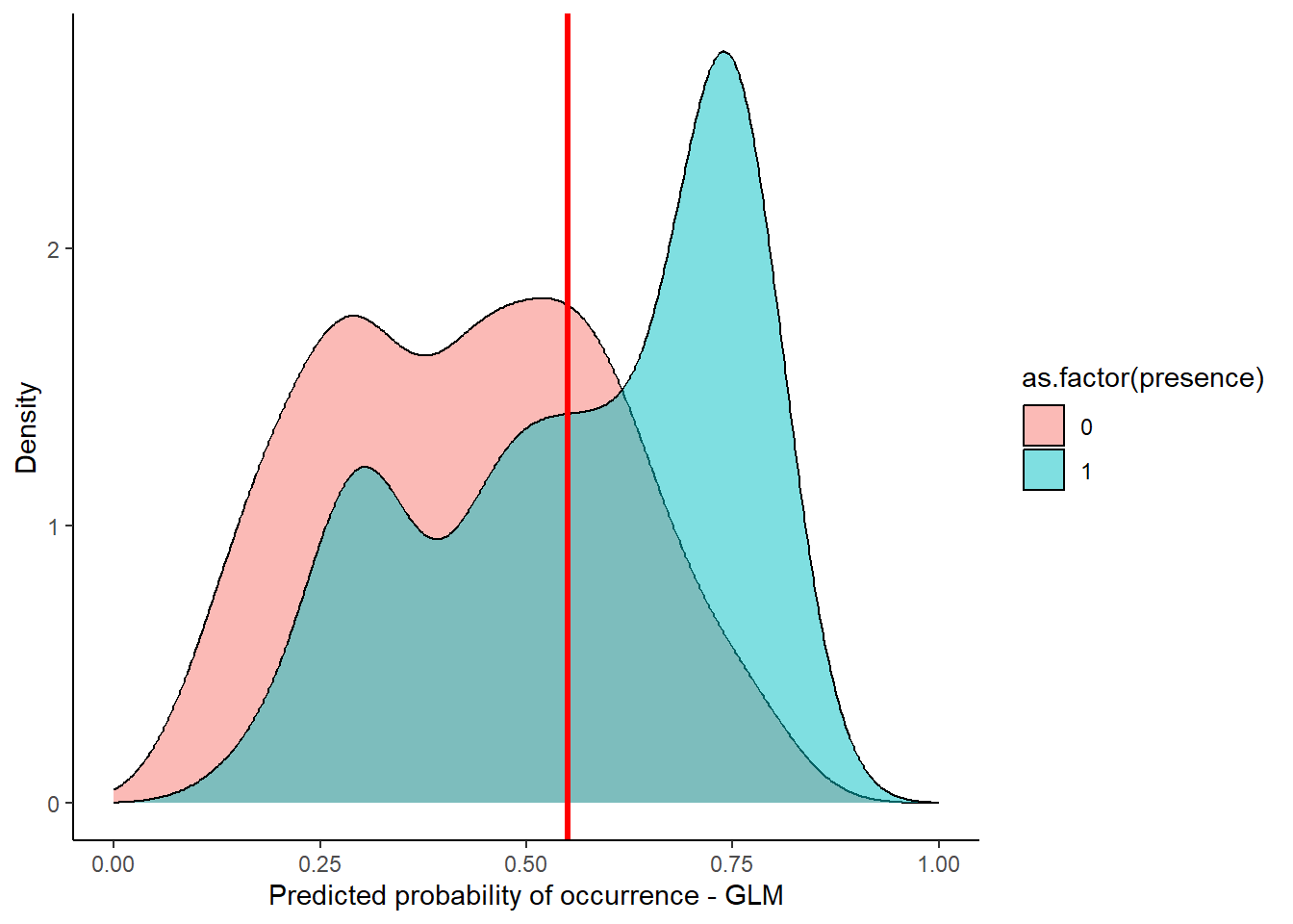
In the next step, we use this (or any other choosen threshold) to create a column with binary classification of our model predictions. We will save this classifications in a new column glm_classification with mutate() function. To create the binary classification, we can use the case_when() function from dplyr. We tell this function to create a value of 0 when glm_4_predictions < 0.55 and value of 1 when glm_4_predictions >= 0.55.
library(dplyr)

stirius_pa_final <-
    mutate(
        stirius_pa_final,
        glm_classification = case_when(glm_4_predictions < 0.55 ~ "0",
glm_4_predictions >= 0.55 ~ "1"))View(stirius_pa_final)To create a confusion matrix, we will use xtabs() function to which we need to specifiy, the two columns with 0s and 1s (~ glm_classification + presence) and the dataframe where the two are stored (stirius_pa_final). The function will go through the column and counts pairs of 0 and 0, 1 and 1, 0 and 1, 1 and 0:
xtabs( ~ glm_classification + presence, stirius_pa_final) presence
glm_classification 0 1
0 105 62
1 45 88Using these number, we can calculate the sensitivity and specificity
- sensitivity (TP / [TP + FN]) and
- specificity (TN / [TN + FP])
of glm_4 at 0.55 threshold:
#sensitivity (TP / [TP + FN])

88 / 150
[1] 0.5867# specificity (TN / [TN + FP])
105 / 150[1] 0.7Random forest model
For random forest model we have to create predictions manually. We need to use predict() function, which requires:
- a model, that will be used for predictions (
rf_full) and - the predictor variables, that model will use to calculate predictions (bio2 - bio18). The simplest way is to
select()them from stirius_pa_final.
We will add this predictions to stirius_pa_final using mutate() as above. Again a small but important tweak in the code is putting the predicted values rf_full_prediction within unname(). This step is needed, as otherwise row names are attached for some reason and we would not be able to apply subsequent functions to the actual values:
rf_full_prediction <- predict(rf_full,
                              dplyr::select(stirius_pa_final,
                                            wc2.1_2.5m_bio_2:wc2.1_2.5m_bio_18))

stirius_pa_final <- stirius_pa_final %>%
    dplyr::mutate(rf_full_predictions = unname(rf_full_prediction))
Lets also visualise how the actual presences and pseudo-absences are distributed along the predicted value of the RF model. Right away, I added an arbitrary threshold line at 0.42 (geom_vline(xintercept = 0.42)), that seems reasonable to classify our model output to binary categories:
ggplot(stirius_pa_final , aes(x = rf_full_prediction, fill = as.factor(presence))) +
    geom_density(alpha = 0.5) +
    xlim(c(0,1)) +
    theme_classic() +
    geom_vline(xintercept = 0.42,col = "red", lwd = 1.2) +
    ylab("Density") +
    xlab("Predicted probability of occurrence - RF")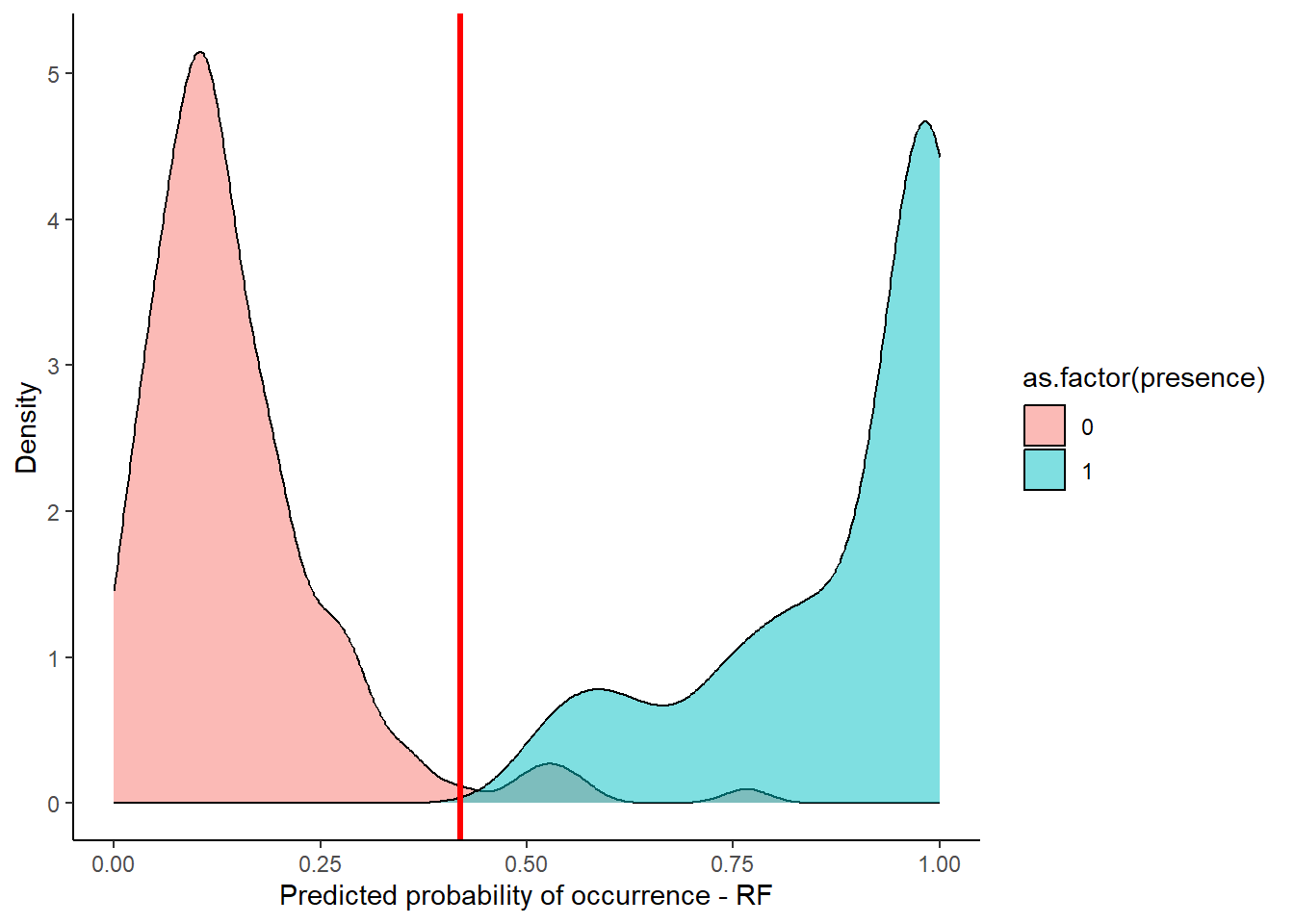
In the next step, we use this (or any other chosen threshold) to create a column with binary classification of our model predictions. We will save this classifications in a new column glm_classification with mutate() function. To create the binary classification, we can use the case_when() function from dplyr. We tell this function to create a value of 0 when rf_full_predictions < 0.42 and value of 1 when rf_full_predictions >= 0.42.
stirius_pa_final <- stirius_pa_final %>%
        mutate(rf_classification = case_when(rf_full_predictions < 0.42 ~ "0",
                                             rf_full_predictions >= 0.42 ~ "1"))
To create a confusion matrix, we will use xtabs() function to which we need to specifiy, the two columns with 0s and 1s (~ rf_classification + presence) and the data frame where the two are stored (stirius_pa_final). The function will go through the columns and counts pairs of 0 and 0, 1 and 1, 0 and 1, 1 and 0:
xtabs( ~ rf_classification + presence, stirius_pa_final) presence
rf_classification 0 1
0 145 0
1 5 150And we use this value to calculate:
- sensitivity (TP / [TP + FN]) and
- specificity (TN / [TN + FP])
of Random forest model at 0.42 threshold:
#sensitivity (TP / [TP + FN])

150 / 150
[1] 1# specificity (TN / [TN + FP]
144 / 150[1] 0.96Plot ROC curve and calculate AUC value with ROCR package
Model evaluation using ROCR package starts with creating a prediction object. This function is used to transform the input data into a standardized format. To the prediction() function, we need to provide a vector containing the predictions (stirius_pa_final$glm_4_predictions) and a vector containing the true class labels or values (stirius_pa_final$presence), both must have the same dimensions. We supply these prediction to a function performance(), which can evaluate different model performance metrics. As we want to plot the ROC curve, we need to evaluate True positive rate (or sensitivity; "tpr") and false positive rate (or 1 - specificity; "fpr"). We save the results of these calculations to an object called roc_GLM:
install.packages("ROCR")library(ROCR)
roc_GLM <- ROCR::performance(prediction(stirius_pa_final$glm_4_predictions,
stirius_pa_final$presence),
"tpr", # sensitivity
"fpr") # 1 - specificityTo plot the ROC curve for glm_4 model we simply use plot() function. To aid our interpretation of the plot, we will also add the diagonal with abline() starting at (0,0) and going to (1,1). I colored it grey, so it is not the focus of the plot:
plot(roc_GLM, lwd = 3)
abline(a = 0, b = 1, col = "grey", lwd = 2)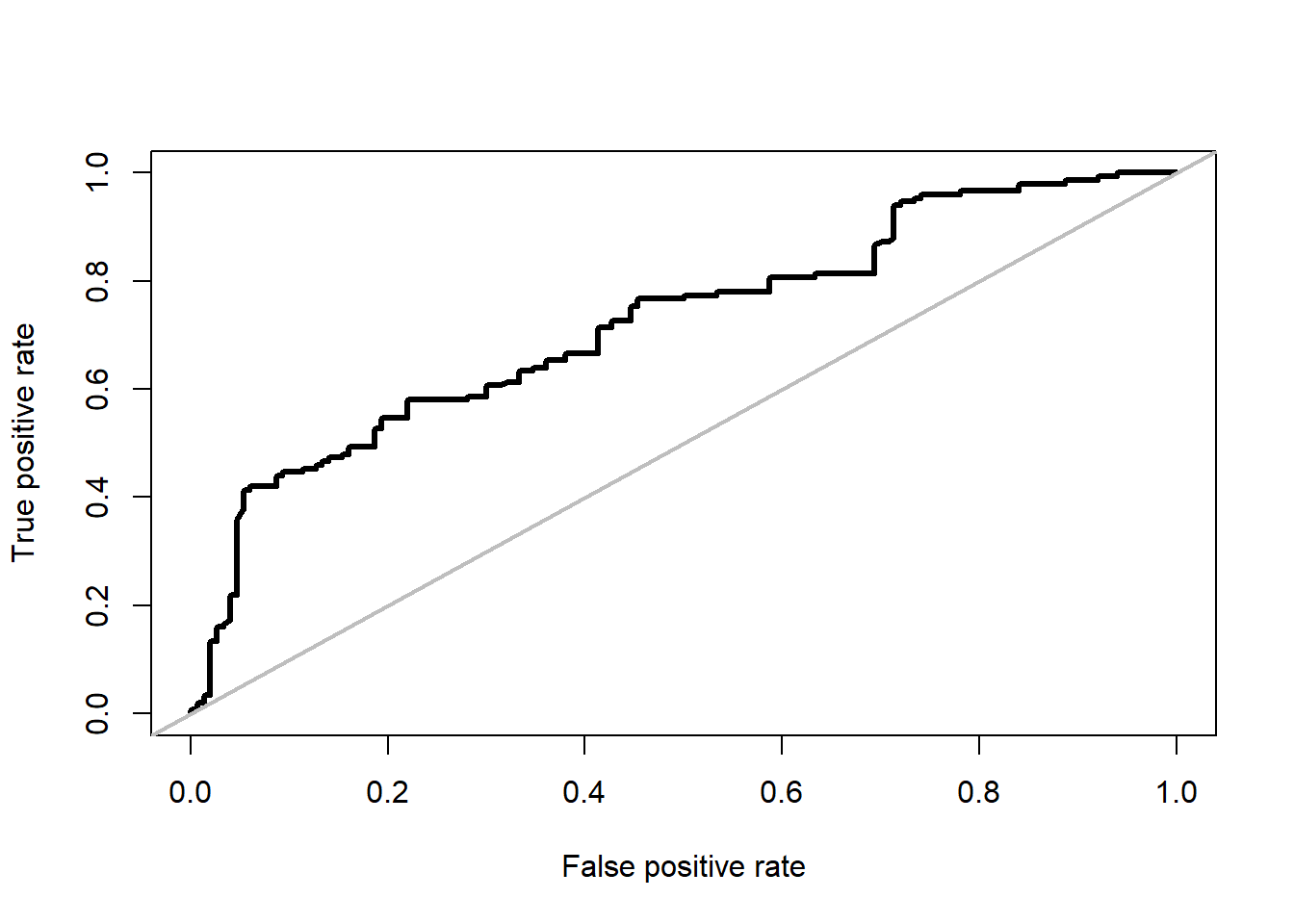
We repeat the same proces for random forest model, only these time we need to evaluate its prediction (stirius_pa_final$rf_full_predictions) towards actual values of presences (stirius_pa_final$presence):
roc_rf <- ROCR::performance(prediction(rf_full_prediction,
                                       stirius_pa_final$presence),
                            "tpr", # sensitivity
                            "fpr") # 1 - specificity


plot(roc_rf, lwd = 3)
abline(a = 0, b = 1, col = "grey", lwd = 2)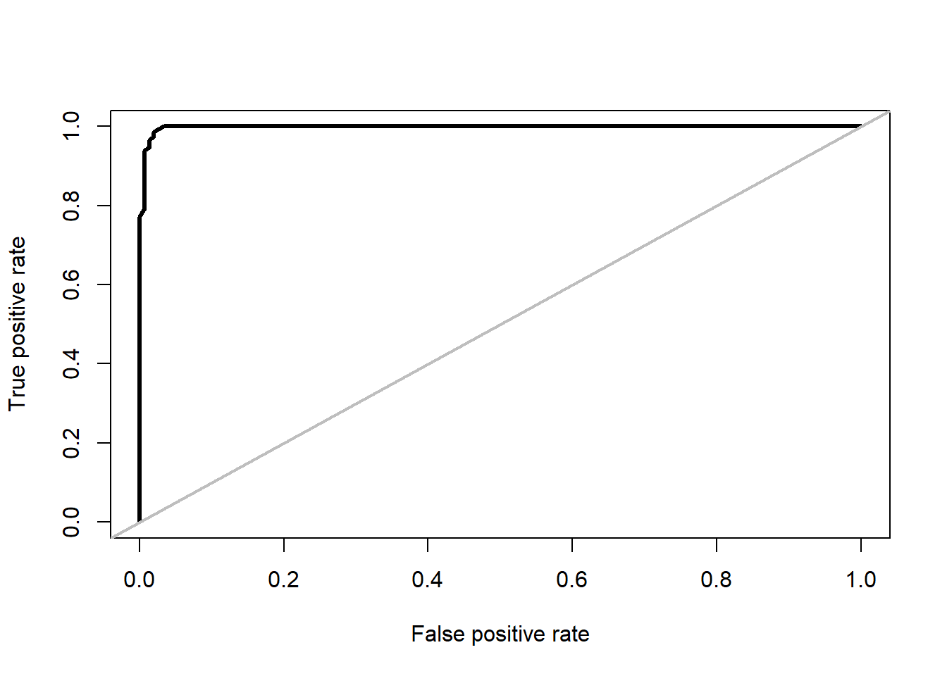
For easier comparison, we plot both on the same graph, by add = TRUE in the second call to plot. Note that colors were added to both calls and the legend, to be able to distinguish between the two ROC curves. Lastly, we can also add the points for the thresholds we calculate above for GLM (0.55) and RF model (0.42):
plot(roc_GLM, col = "green", lwd = 3)

abline(a = 0, b = 1, col = "grey", lwd = 2)


plot(roc_rf, add = TRUE, col = "blue", lwd = 3)

legend("bottomright",
       legend = c("GLM", "RF"),
       col = c("green", "blue"),
       lwd = 3)

points(x = c((1 - 0.96), (1 - 0.7)), # 1 - specificity
       y = c(1, 0.586), # sensitivity
       col = "red",
       lwd = 3)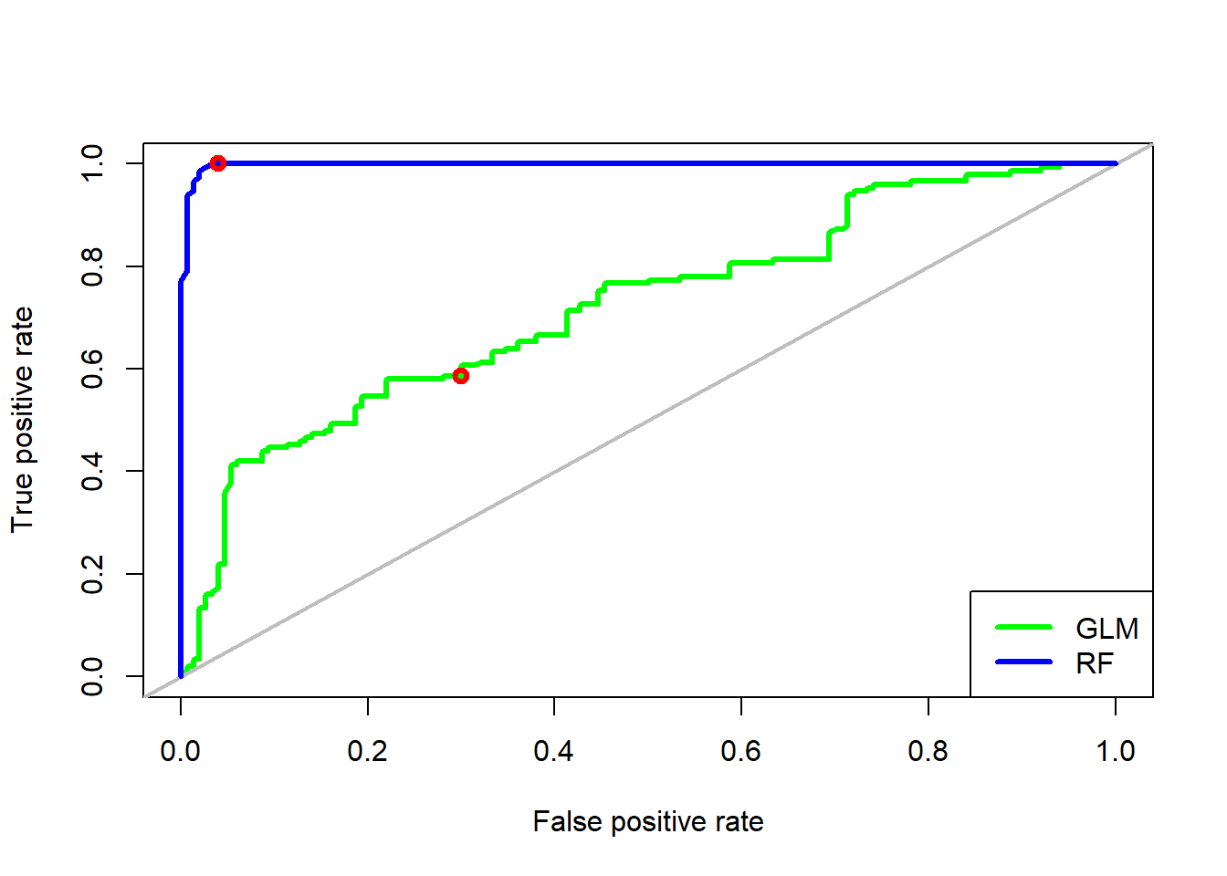
The Area Under the ROC Curve (AUC) test is derived from the ROC curve. Predictive performance of a model across full range of thresholds is measured as the area under the ROC curve, expressed as a proportion of the total area of square defined by the axes. AUC can range in values from 0 to 1. However, a model which predictions are random would have an AUC of 0.5 and the model which predictions are 100% correct has an AUC of 1.0.
AUC calculation using ROCR package starts with creating a prediction object. To the prediction() function, we need to provide a vector containing the predictions (stirius_pa_final$glm_4_predictions or stirius_pa_final$rf_full_predictions) and a vector containing the true class labels or values (stirius_pa_final$presence), both must have the same dimensions. We supply these prediction to a function performance(), which can evaluate different model performance metrics. As we want to calculate the AUC we specify the argument measure = "auc"). We extract the actual value of AUC by @y.values:
ROCR::performance(prediction(stirius_pa_final$glm_4_predictions,
                             stirius_pa_final$presence),
                             measure = "auc")@y.values
[[1]]
[1] 0.7216ROCR::performance(prediction(stirius_pa_final$rf_full_prediction,
stirius_pa_final$presence),
measure = "auc")@y.values[[1]]
[1] 0.9979AUC is one of many test statistics to evaluate model predictive performance. Among benefits of AUC, there are also some drawbacks of the metric. Most notably, AUC was demonstrated for being heavily dependent on the relative occupied area: models for more restricted (specialised) species get generally higher AUC, while models for species with wider geographic distributions (generalists) get generally lower AUC values.
AUC is thus often combined with other metrics for model predictive power (Pearson 2010, pp. 78; Guisan et al., 2017, pp. 254):
- True Skill Statistics (TSS)
- (weigthed) Cohen’s kappa,
- area under precision - recall curve (AUC PR),
- etc.
Model representation
Within research area (buffers)
First we load the data created in our second lab in which we cropped the environmental data to the buffer created. It was saved as bioclim_stirius.RDS and we will save it to an object of the same name bioclim_stirius.RDS. Due to some requirements of the terra package, we need to use the unwrap function on the imported raster layers to make them functional:
library(terra)

bioclim_stirius <- unwrap(readRDS("01_data/bioclim_stirius.RDS"))

names(bioclim_stirius)
[1] "wc2.1_2.5m_bio_2" "wc2.1_2.5m_bio_4" "wc2.1_2.5m_bio_6"
[4] "wc2.1_2.5m_bio_8" "wc2.1_2.5m_bio_15" "wc2.1_2.5m_bio_17"
[7] "wc2.1_2.5m_bio_18"To represent the model within our reseach area, we need to use a predict() function from terra package. The difference is, that we will use the raster object for predictions (bioclim_stirius) and the results itself will be a raster layer that we will name glm_geographic_prediction. We need to specify, that we want the predictions to be of a type "response" and which model the predict should use to calculate predictions (glm_4):
glm_geographic_prediction <- predict(bioclim_stirius,
                                             glm_4,
                                             type = "response")
To visualise glm_geographic_prediction with leaflet we first need to install the development version of the package:
remotes::install_github("rstudio/leaflet")Next, we need to use one of the predefined palette of colors that we will save to pal1 object using colorNumeric() function: the data we are plotting are continuous numbers. We will use the "reds" pallete, set the possible range of values between 0 and 1 (domain = c(0, 1)) and set the color for NAs to be transparent:
library(leaflet)

pal1 <- colorNumeric("Reds",
                     domain = c(0,1),
                     na.color = "transparent")
We will plot the GLMs geographic predictions with plet() function in which we need to define the basemap (tile =), collors that will be used (col =), the name of the legend (main =) and the transparency of the plotted raster (alpha =):
plet(glm_geographic_prediction,
            tile = "Esri.WorldImagery",
            col = pal1,
            main = "Probability of presence",
            alpha = 1)
An repeat the same procedure for Random Forest model:
rf_geographic_prediction <- predict(bioclim_stirius,
                                            rf_full,
type = "response")plet(rf_geographic_prediction,
tile = "Esri.WorldImagery",
col = pal1,
main = "Probability of presence",
alpha = 1) Extrapolation of model results outside of the research area
We will limit the extent of extrapolation to the wider area of Alps. We define it using function ext(), where we specify the outer bounds of the range we want to select.
alps_extent <- ext(6, # minimum longitude
                   17, # maximum longitude
                   44, # minimum latitude
                   48) # maximum latitude
We will need the global bioclimatic data again, that we will crop by the extent created:
bioclim_data <- geodata::worldclim_global(var = "bio",
                                          res = 2.5,
                                          path = "01_data")

alps_present <- crop(x = bioclim_data, y = alps_extent)

names(alps_present)
[1] "wc2.1_2.5m_bio_1" "wc2.1_2.5m_bio_2" "wc2.1_2.5m_bio_3"
[4] "wc2.1_2.5m_bio_4" "wc2.1_2.5m_bio_5" "wc2.1_2.5m_bio_6"
[7] "wc2.1_2.5m_bio_7" "wc2.1_2.5m_bio_8" "wc2.1_2.5m_bio_9"
[10] "wc2.1_2.5m_bio_10" "wc2.1_2.5m_bio_11" "wc2.1_2.5m_bio_12"
[13] "wc2.1_2.5m_bio_13" "wc2.1_2.5m_bio_14" "wc2.1_2.5m_bio_15"
[16] "wc2.1_2.5m_bio_16" "wc2.1_2.5m_bio_17" "wc2.1_2.5m_bio_18"
[19] "wc2.1_2.5m_bio_19"plot(alps_present)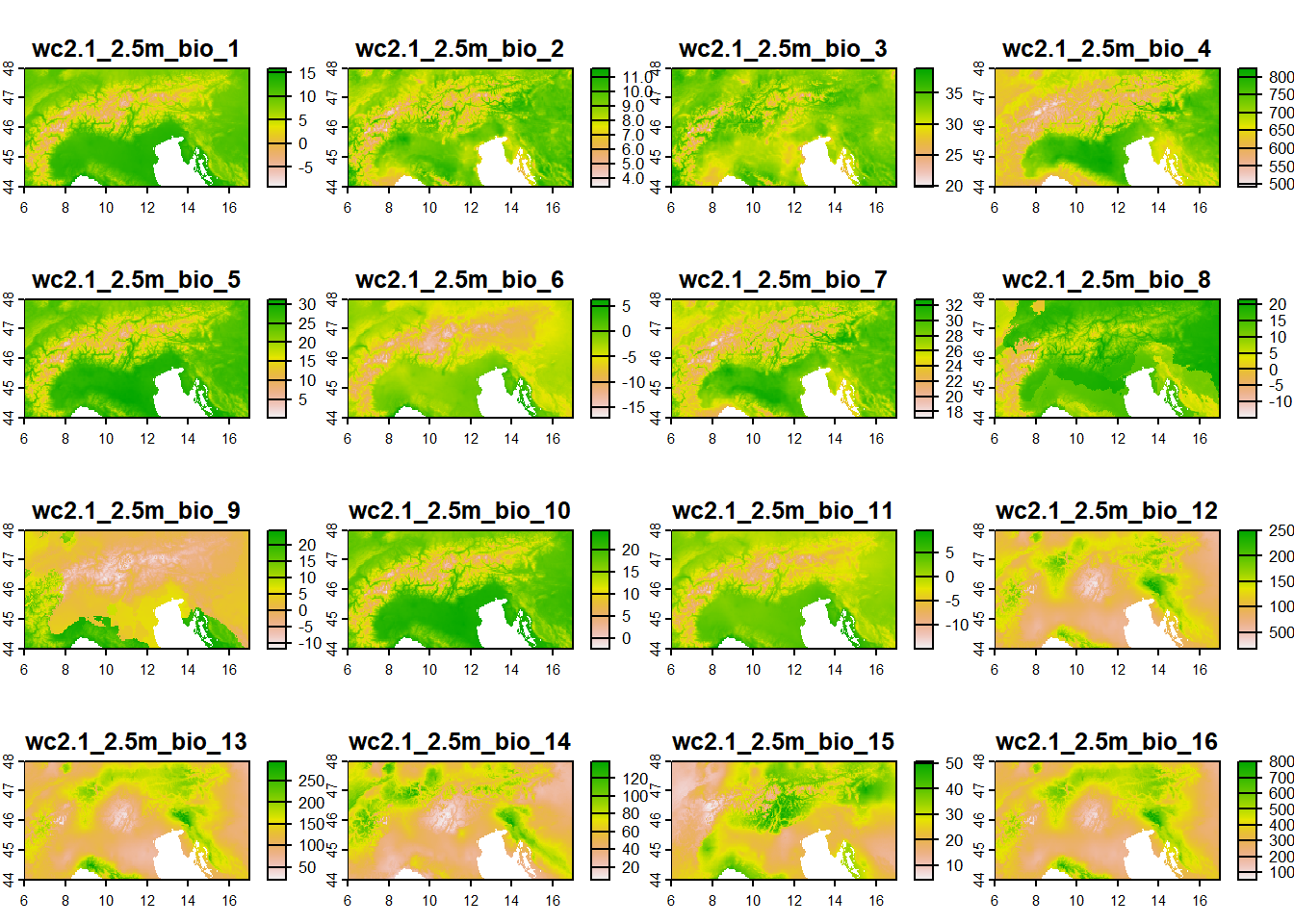
We use function predict() from terra package to project habitat suitability of our species to extrapolatated geographical extent. Within it, we specify which one of our models we want ot use (glm_4 or rf_full) and which object contains raster layer(s) with bioclimatic variables (alps.present):
alps_prediction_rf <- predict(alps_present,
                              rf_full,
                              type = "response")

alps_prediction_glm <- predict(alps_present,
                               glm_4,
                               type = "response")
We will use this predictions and map it with plet() with color palette going from 0 (not suitable) to 1 (suitable habitat), the pal1.
The GLM extrapolation:
plet(alps_prediction_glm,
            tile = "Esri.WorldImagery",
            col = pal1,
            main = "Probability of presence",
            alpha = 1)
The random forest extrapolation:
plet(alps_prediction_rf,
            tile = "Esri.WorldImagery",
            col = pal1,
            main = "Probability of presence",
alpha = 1) 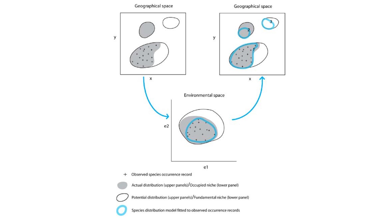
And save some of the created object for further use:
saveRDS(glm_geographic_prediction, "01_data/glm_geographic_prediction.rds")

saveRDS(rf_geographic_prediction, "01_data/rf_geographic_prediction.rds")

saveRDS(alps_prediction_rf, "01_data/alps_prediction_rf.rds")

saveRDS(alps_prediction_glm, "01_data/alps_prediction_glm.rds")
Assignment
Open R script that you named after the species you choose to work on.
Copy - paste
today'scode from theErebia stiriusscript to the end of your script.Adapt the code to achieve the following:
3.1) add the columns for predictions and classifications at selected threshold for the GLM and RF model,
3.2) compose confusion matrix and calculate sensitivity and specificity of both models,
3.3) plot the ROC curves and calculate AUC values for both models,
3.4) create visual representation of your model within research area (buffer) and extrapolate to wider area.
3.5) save the script with the code for your species,
3.6) make sure that the project folder will be available to you next week at the labs (either store it on USB, cloud or similar, in case it gets deleted from computers).